
After 100+ Apps - This is the Most Important Consideration Before you Build
10 UX options so you can answer 'How will the experience help the user get their job done, and how will the UI play a leading role in relieving their pains and creating their gains?'


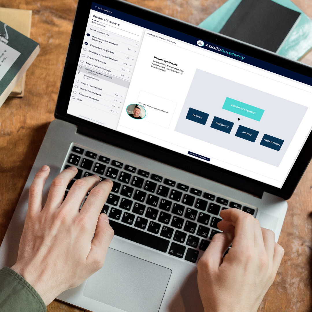
It's time to build your application and get the rocketship ready for launch. I assume you've done your homework in Product Discovery. That means lots of user testing and feedback, and you have a rough prototype. If you don't have many learnings from discovery, you should do this course first.
At the start of development, you should have a good sense of 'what' you must build regarding functionality and some screens. In addition, you should be very clear on the 'why' you're making this. You should have a clear vision for your product or company on how it will impact people in the future.
At the beginning of development, a significant consideration is 'how' the application will work. And by 'how', I mean the user experience strategy. How will the experience help the user get their job done, and how will the UI play a leading role in relieving their pains and creating their gains?
The beautiful thing about building a brand-new application and product is that you have so many options. I have pulled together some options for you, and I strongly recommend that you try at least these as your app's central user experience strategy.
Here are ten types of popular website application user interfaces, along with their examples, pros, and cons:
- Drop-down Menus: Drop-down menus are a popular way to organize content and give users easy access to different pages or sections of a website. Pros: They save space and make navigation simpler. Cons: They can be challenging for mobile devices or users with motor disabilities. Example: Amazon's navigation menu.
- Hamburger Menus: Hamburger menus are a type of hidden menu that can be accessed by clicking on a button with three horizontal lines. Pros: They save space and provide a clean design. Cons: They can make navigation less intuitive and may be overlooked by some users. Example: Facebook's mobile app menu.
- Grid Layouts: Grid layouts organize content neatly and orderly, often using a series of boxes or tiles. Pros: They are visually appealing and provide a clear hierarchy of information. Cons: They may not work well for websites with much text-heavy content. Example: Pinterest's home page.
- Card Design: Card design uses rectangular or square boxes to present content visually appealingly. Pros: They make it easy to organize and offer a variety of content types. Cons: They may not be suitable for content-heavy websites. Example: Airbnb's search results page.
- Hero Images: Hero images are large, high-quality images often occupying a web page's top section. Pros: They are visually striking and can create an emotional connection with users. Cons: They may slow down page load times and may not be accessible to users with visual impairments. Example: Apple's homepage.
- Infinite Scrolling: Infinite scrolling automatically loads more content as the user scrolls down the page. Pros: It provides a seamless user experience and can encourage users to stay on the site longer. Cons: It can make it difficult for users to find specific content, and it may slow down page load times. Example: Instagram's feed.
- Tabbed Navigation: Tabbed navigation organizes content into different tabs that users can switch between. Pros: It provides an easy way to manage large amounts of content and helps users find what they want. Cons: It may not work well for websites with a lot of content, and users may overlook some tabs—for example, Google Drive's navigation menu.
- Sticky Navigation: Sticky navigation is fixed navigation that stays at the top of the screen even when the user scrolls down the page. Pros: It provides easy access to navigation options and can improve user engagement. Cons: It can take up valuable screen space and may not work well for mobile devices. Example: Forbes' website.
- Modal Windows: Modal windows are temporary windows that overlay the current web page to provide additional information or prompt users to take action. Pros: They can grab the user's attention and focus their attention on a specific activity or piece of information. Cons: They may interrupt the user's workflow and be annoying if overused. Example: Twitter's login prompt.
- Full-Screen Video Backgrounds: Full-screen video backgrounds use videos playing in a web page's background. Pros: They can create an immersive experience and engage users visually. Cons: They can slow down page load times and may not be accessible to visually impaired users. Example: Wistia's homepage.
Each user interface has advantages and disadvantages, and choosing the right one depends on your website's and your users' specific needs. For example, a topic for another blog post is how the UI reflect the business model of the product or service. For now, let's make sure we have Plans A and B for user experience strategy.